Social media is a platform for communication, opinions and expert advice. But at the same time people still need to get a clear perception of what your company is all about, without actually engaging with you, i.e social media branding. In this article we’re going to go through and show how the big guns, i.e global brands, utilise their social media on Facebook and Twitter to give fans and followers a ‘perception’ or ‘look’ which fits their strategy and target audience.
You need a good header, good image and something that will imprint into your followers’ minds every time they think of your brand (depending on what platform you use).
Starbucks
Let’s look at Starbucks. A massive organisation and nearly everyone you know will have heard of them. What do you think about when you think of Starbucks? Most people will visualise the green logo with the lady’s face and wavy hair. This is known world wide through their chain of coffee shops. But surely, if it’s a logo, it should effectively be seen on most of their social media platforms. But is this right? Well, Starbucks like to do things ever so slightly different while keeping it ‘fresh’ at the same time.
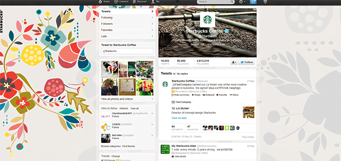
If you take a look at their Twitter profile, their default picture is, as expected, the green logo with the woman’s face. But if you look at the background image used, it’s of a colour scheme not completely on theme. There isn’t any green, just an interesting selection of colours which look funky, cool and fresh. This is clearly what they’re aiming for.
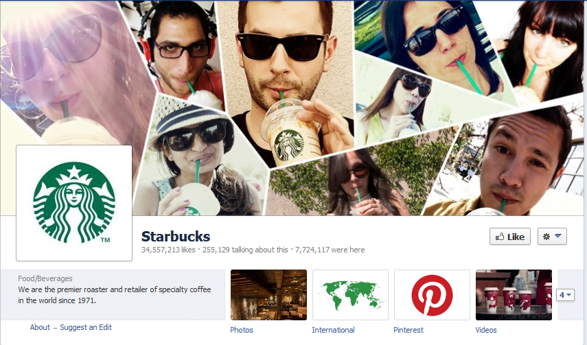
Let’s now have a quick look at their Facebook page. Just by having a brief glance at their profile, you can see it’s pretty eye catching to say the least. You’ve got snapshots of Starbucks lovers, probably from all around the world, who they’ve probably chosen at random. Their cover photo looks bright with vibrant, young adult and upwards connotations. This is reflected in their target audience. For example, I know many people who love Starbucks, and they are generally 18 years old and upwards. Again, like the Twitter page, you have the green logo as the default image. All in all, if you were new to Starbucks, then surely this would engage you.
Amazon
Amazon is one of the biggest online retailers and it reflects with their social media. Below is a screen shot of their Twitter profile. First thing you will notice is the colourfulness and how vibrant the page looks. Having said that, if you’ve ever been on Amazon’s website, they’ve got that yellow/orange theme on-going throughout. However, they’ve kept it quite subtle on their Twitter page, but it still runs throughout using their logo default picture and link colours.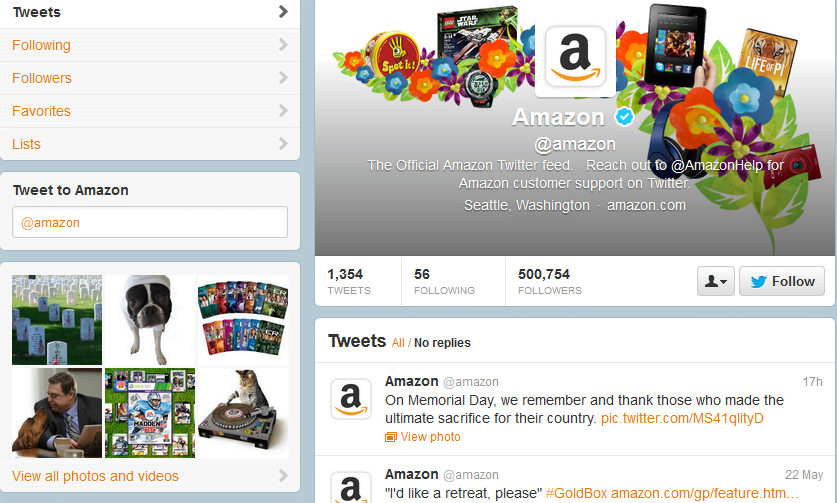
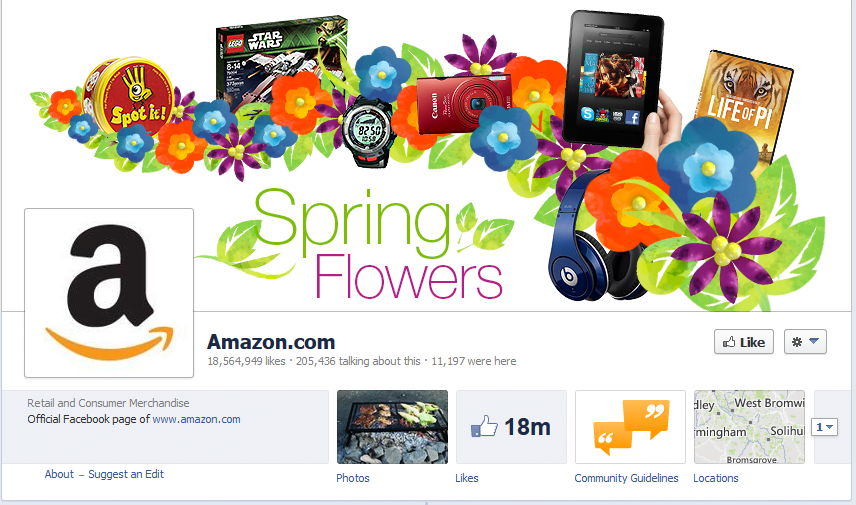
Below is a shot of Amazon’s Facebook page. Again, colours are upbeat and very eye-catching. Just by looking at their cover photo you can tell that they frequently update this page; it’s always on theme in terms of seasonal activities and products. This is reflected by the ‘Spring Flowers’ and the floral theme, but blended in is the well-known Kindle and Dr Dre Beats headphones and so on (offering their products to you subconsciously). Again, their very simple logo, with the use of two colours: black and orange on a white background still distinctively stands out and doesn’t get lost in all the other colours on the page.
Coca-Cola
Last but by no means least, it’s Coca-Cola. A global brand which has been around for many, many years. By just half glancing at this Twitter profile, I’m pretty sure the majority of people will know exactly who this company are. They’ve got the very distinctive red theme throughout which merges well with their red and white logo. The default picture is very effective; everyone knows who Coca-Cola are so they just use an image of the classic glass bottle with red label, simple. Again, on their background image behind the default picture, there’s a variety of snap shots, from all angles of the Coca-Cola consumer audience. You would look at that and think: everyone knows, and a lot of people drink, Coca-Cola.
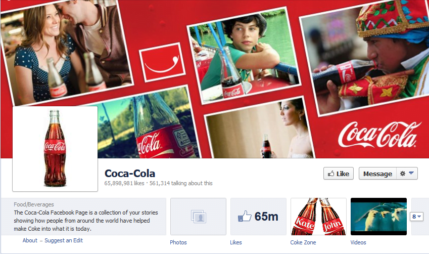
Below is Coca-Cola’s Facebook page. If you notice, they use the same ‘theme’ as the Twitter page (with the layout etc) but the images are slightly different. At the same time though, it just gives people a perception that everyone and anyone can and does use their product! Just for a second, even if we were to ignore the 65 million plus likes and just focus on the visuals, we can see Coca-Cola’s social media has still been nailed with perfection. Highlighting how much of a wide scoping brand it is, enjoyed by many cultures.
Overall, this was a brief overview of which social media platforms are most commonly used within the global market. However, as a business owner or marketing manager, you can take these ideas and implement them into your own strategies. Keep colours simple and on theme, really get your logo out their and don’t be afraid to look like a fun brand! Whether it’s the colours, words or phrases, something has to stand out in order for people to view it and want to come back to your profile.
If you would like to read how brands such as Coca-Cola and Starbucks use other social media platforms in order to engage with their audience, check out my other article How to Use These Social Media Platforms to Promote Your Products.


