In this article you are going to learn how you can increase the amount of money that your website is making without getting any extra traffic!
So, what I will be talking about here is usability and conversion. I will also mix a little bit of new technology, which is based on social media proof .
What result has your SEO got for you?
Picture the following scenario. You have a website that is getting 2,000 visitors per month and your conversion rate is 2 percent. Now if your goal is to double your sales, then there is two ways you can do it.
Use SEO to increase targeted traffic
Your first option is to do more SEO to get more traffic to your site.
The big question here is what type of keywords are they? If there are more keywords that are buying signal type keywords, then further SEO is a good option.
There may be more appropriate keywords for your product or service that you are not currently ranking for. But if they are information or research type keywords then further SEO to rank for these keywords is perhaps not the best option. You may get the odd new sale from them but generally speaking, these types of keywords do not convert well!!
Improve conversion
What if you can make just a few changes to your website to make it more appealing and usable to the visitor so that you double your conversions from 2 percent to 4 percent?
In this instance, you will have effectively doubled your sales without any extra traffic to your website.
So how you should go about doing this; well, the first thing we’ll do is to go back to the basics. The purpose of every business website is to make money. So the first thing you have to do is be clear on what it is that you want someone to do when they visit your website.
There are three main options and everything else will come under one of these 3 points. You want the person to either:
- Contact you via the telephone i.e. ring you!
- Enter their name and contact details so that you can market to them
- Buy something directly from your website.
If you go into Google and do a search for “secured loans”… Many websites will appear. Let’s just do a quick comparison of two sites that appear on page 1.
One of the first websites to appear is from Barclays.
So what is the call to action on this page?
When you study it it’s quite easy to see that there is an Enquire now button in the middle of the screen, which is quite good because it has some space around the button.
Let’s compare this to another website that appears on page 1
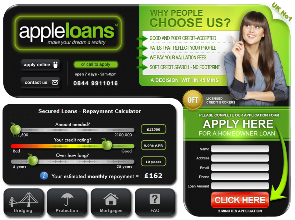
This site has good clear call to action. It uses colour to attract you to the CLICK HERE button and it has a nice big green arrow that tends to draw your eye to the call to action button.
This leaves the customer in no doubt that the website wants them to complete the short enquiry form!
Be clear on what you want your customers to do
Once you are clear on what it is that you want your customers to do, you need to set up your website in a way that the customers are left in no doubt on what you actually want them to do.
If you want them to ring you, do not hide your phone number and contact details away on a contact us page. Have your phone number up on the right top hand corner of your website so that it is large enough to draw the eyes of the customer.
How good is your sales copy?
The next thing to do is to look at the sales copy that is written in your pages. Ensure that it is professionally written so that it entices the person to complete your chosen action. List the benefits that the customer can get with your products and services and not so much of the features.
Unfortunately, the majority of business websites take the same old boring routine with things like “Welcome to our website. We are a company that has been in business for 15 years and we pride ourselves on excellence”.
At the end of the day, the customer doesn’t really care about that. What they care about is the feeling they are going to get from your products or services. So tell them how they will feel when driving away from the car showroom in a new car and they will become the envy of their friends.
Tell them how fantastic their life is going to be once they put these new products into their household, saving them time from the drudgery of housework.
Also, have a clear and concise call to action. Don’t take it for granted that they will see your phone number and wait to call you. Tell them, call us now and give the number. Remember, people like to be guided on what they do.
Google’s Golden Triangle
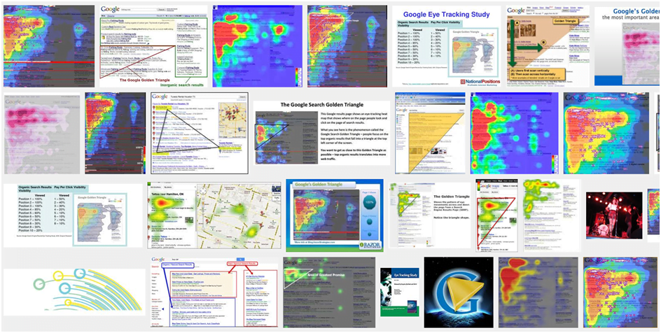
if you go into Google and do a search for “Google’s Golden Triangle” and then click on images you see something like this:
This diagram shows the research that Google put into figuring out where people look on a webpage.
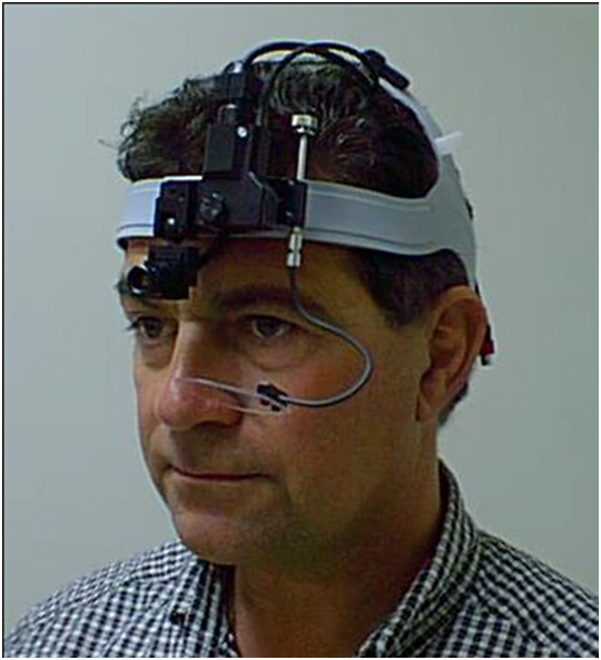
Google employed lots of people to wear equipment like you see the gentleman on the right wearing
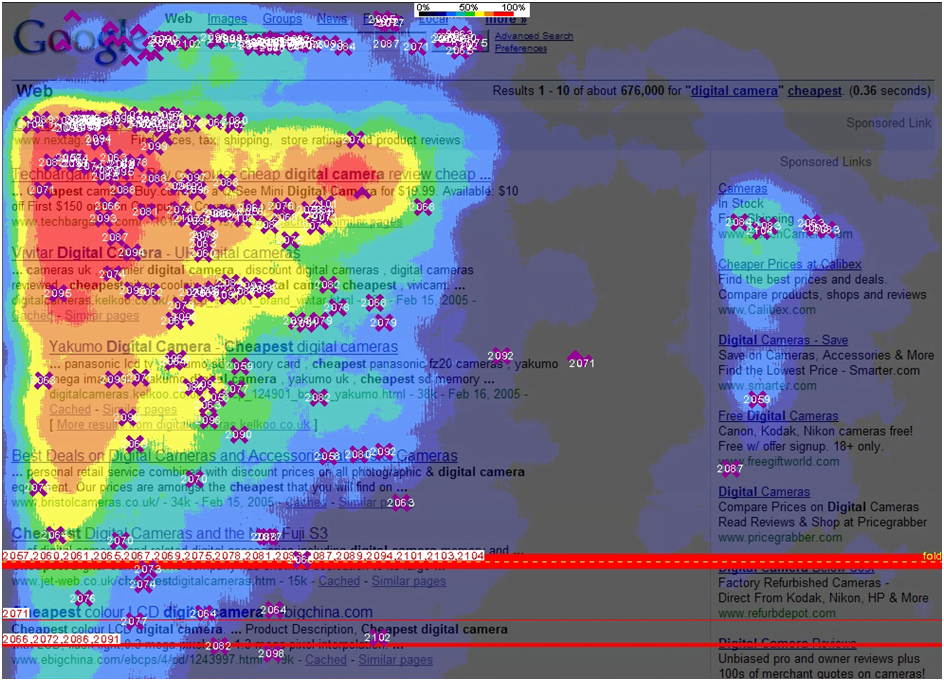
from this, they figured out where it is exactly people look on the screen and as you can probably guess, it’s top left…
So when placing your calls to action on the website, take this into account. Most people put their main message top left and put their calls to action either close by or if not they use the top right position.
Unless you can make it so you lead someone’s eyes to the bottom right-hand area of the screen, through clever design… Probably the worst place to put your call to action is bottom right, just below the fold!
Conclusion
Define what you want your customer to do. Then, change the sales copy on your site so that it talks about the benefits and not about the features.
Make sure that your web pages have a clear and concise call to action. By making these changes, I am sure you can increase the amount of conversions that your website is getting.
My call to action is… If you need help on this… please call Steve Feeney on 0121 667 8785


